教學影片:Effective Navigation Development
重點語法整理:
vmaya 發表在 痞客邦 留言(0) 人氣(166)
Unlock the Secret to the Lens Flare in Photoshop
有時候當我們想幫照片加上鏡頭反光Len Flare時,會遇上一些限制
解決方法的整理筆記如下:
1.複製欲加上光源效果的現有圖層
2.點選 濾鏡Filter>光源效果Render > 鏡頭反光Len flare
3.新增一個空白圖層
4.填滿黑色
5.點選 濾鏡 > 重覆上個濾鏡 Ctrl+F
6.刪除剛剛為了建立動作5的複製的圖層(已經不需要了)
7.圖層效果 >覆蓋
8.你可以選擇是否更改透明度 Opacity
9.你可以選擇是否設立光源中心點,做旋轉縮放等光源位置移動
10.你可以選擇是否加上 濾鏡 > 高斯模糊Gaussian blur 來淡化光源銳利度 或是使用圖層遮色片Mask
English Note
vmaya 發表在 痞客邦 留言(0) 人氣(49)
vmaya 發表在 痞客邦 留言(0) 人氣(7)
一個簡單,響應式,流動式導覽教學
簡單地說,是要先設計一個小屏幕的界面,然後才設計大屏幕的界面。
vmaya 發表在 痞客邦 留言(0) 人氣(253)
vmaya 發表在 痞客邦 留言(0) 人氣(518)
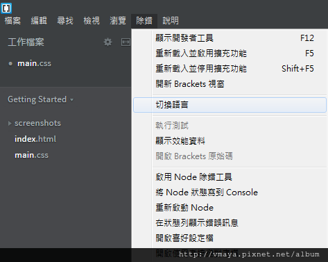
這套軟體可自由切換至繁體中文
安裝完以後,也可以透過左側的index.html來學習基本功能
vmaya 發表在 痞客邦 留言(0) 人氣(809)
快捷提示:別忘記Viewport Meta標籤
http://webdesign.tutsplus.com/zh-hans/articles/quick-tip-dont-forget-the-viewport-meta-tag--webdesign-5972?ec_unit=dropdown-language
下列的值可以作為我們的默認設定模版:
vmaya 發表在 痞客邦 留言(0) 人氣(236)
div:selection{
color:black;
background-color:yellow;
}
div:first_letter{
font-size:36px
}
div:first-line{
font-size:24px;
color:green;
}
https://youtu.be/Vafp5xr_bxk?t=1h24m
div:first-child::first_letter{
font-size:36px
}
div:first-child::first-line{
font-size:24px;
color:green;
}
https://youtu.be/Vafp5xr_bxk?t=1h25m
vmaya 發表在 痞客邦 留言(0) 人氣(35)
vmaya 發表在 痞客邦 留言(0) 人氣(299)
vmaya 發表在 痞客邦 留言(1) 人氣(689)


 事件記錄 (3)